COLOURPOP OFF MELROSE EYESHADOW PALETTE // REVIEW
Colourpop's Off Melrose 12-pan eyeshadow palette has quickly become one of my favorite eyeshadow palettes in my makeup collection ever since I bought it last summer! Themed after Melrose Avenue in Los Angeles, one of my favorite cities in the world, I just knew I had to have this palette! The packaging is so pretty with palms trees and metallic gold embossing all over - it perfectly captures the spirit of LA. The shade names are also inspired by the culture of Los Angeles and more specifically Melrose Avenue, which if you aren't familiar, is a street in Beverly Hills that is well known for its trendy boutiques and coffee shops. I actually spent my 18th birthday there a few years ago, which brings back so many memories!
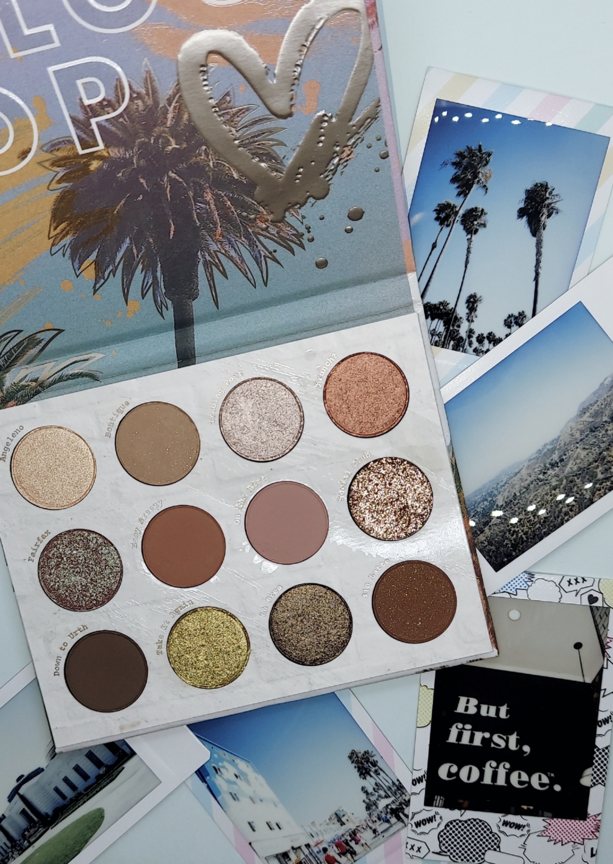
This palette retails for $18 on Colourpop's website. It includes 5 matte shades, 6 metallic shades and 1 pressed glitter. The shades in this palette are mostly cool-toned neutrals, which I have come to realize are some of the most flattering shades on me. Aside from maybe one other mini palette I have, I really didn't have any other shades like this in my collection yet. The Off Melrose palette filled that gap perfectly for what I was looking for. When it was first released, it was marketed as giving you the perfect "model off duty" makeup look, the is kind of the vibe I think a lot of us are going for lately, which is generally more minimal and neutral.

I have shared how much I love Colourpop's eyeshadow palettes ever since I started my blog in 2017 and shared my review of their first ever eyeshadow palette. After all these years, it is still my go-to formula! They are always consistent in quality and pigmentation, as well as having an extensive shade range throughout their line. Even if you aren't drawn to these particular shades in the Off Melrose palette, I can almost guarantee you can find another that will better suit your tastes.
As always, I will go through each shade in this palette and share my thoughts!

Row One
Angeleno: metallic golden champagne - This is one of the most universally-flattering shades in this palette that would work well on every skin tone. It is a simple light gold shade that is so easy to just swipe on the eyelid, inner corner, or even as a face highlight. It is so versatile and brightens up the eye so beautifully.
Boutique: matte soft taupe with silver sparkle - This shade along with "On The List" in the second row are my two favorite matte shades in this palette that I love to mix together. As boring as it may be, a classic mid-toned brown shade like "Boutique" is one of my essential shadows to use day-to-day. This shade has a hint of silver sparkle throughout, which isn't too noticeable when actually applied to the skin.
Trading Post: metallic icy mauve - One of my most used shades in this palette out of all the metallics has to be "Trading Post"! It is so unique compared to any other shade in my eyeshadow collection. Like I said with the first shade "Angeleno", this is also universally-flattering and would look beautiful on every skin tone. My favorite look using this palette is with this shade on the eyelid with "Boutique" and "On The List" blended into the crease.
Brunch?: metallic rose gold with gold flecks - As pretty as it is, this shade does feel a little out of place when looking at the rest of this palette. It is one of the only noticeably warm-toned shades when the rest is neutral or cool-toned. It has a beautiful ultra-metallic finish, but it's just not a shade I use often these days.
Row Two
Fairfax: metallic duochrome lavender with an icy blue flip - Yet another favorite! It is basically a dupe for my absolute favorite Colourpop single shadow in the shade "Glass Bull", which can be hard to find since it is often out of stock. I worried that once I used that single shadow up it would be difficult to find a replacement, but thankfully it is also sold in this palette under a different name! It is the best duochromatic shadow I have ever used, it is so dimensional with a hue of brown, blue, lavender and green depending on the way the light hits it. I just swipe it on with my finger and it gives such a beautiful wash of color and shine to any makeup look! I would love for Colourpop to release a full duochrome palette one day!
Easy Breezy: matte midtone warm brown with rose undertones - A simple matte brown that works well with all of the other shades in this palette. It blends well and would work on a variety of skin tones.
On the List: matte cool-toned lilac rose - Like I said, this is one of my other most-used mattes in this palette, I love mauve tones like this and it looks so flattering on my skin tone. It reminds me of a deeper version of a shade I love in the NYX Mystic Petals palette and the Colurpop In A Trance Palette.
Social Club: bronzy rose gold glitter - I love everything glittery and sparkly, but the Colourpop glitters are generally a no from me for many reasons. This shade is so pretty, but there is no point to it since it isn't eye safe and could very seriously damage your vision if a fleck gets in your eye. The formula is very chunky and flaky, so I really don't think it's even worth risking it. It's essentially just craft glitter, not cosmetic grade at all. If you're looking for an eye safe alternative, I would recommend checking out their Super Shock Shadows, which give a beautiful sparkly effect without the risk of permanently damaging your eyes.
Row Three
Down to Urth: matte cool toned deep brown - I don't often use deep matte brown shades like this, but the quality is up to par with all of Colurpop's eyeshadow formula. It is pigmented, but not too pigmented so that you can still blend it out. When compared to the last shade in the palette, "$10 Latte", this is much deeper and has a cooler undertone. They do look very similar in the pan and when applied to the eye, so I do wish that they chose one and replaced the other with a different shade instead.
Take it Again: metallic golden green - This is one of the bolder metallic shades in this palette, it is such a beautiful shade of green with a golden undertone. It's perfect if you usually gravitate toward simple eyeshadow shades but want to experiment with something a little bit different. A shade like this really pops on the eye!
La Brea: metallic deep mossy brown with gold flip - This is such a unique deep shade with an ultra-metallic finish that looks kind of duochromatic when applied to the lid. While I don't wear deep shades like this often, I think this would look so beautiful on a darker skin tone!
$10 Latte: matte chestnut brown with gold flecks - Out of all the shade names, this has to be my favorite! Like I mentioned earlier, this is very similar to "Down to Urth", except slightly warmer and with a sparkly effect in the pan. The sparkle isn't noticeable once applied though, as it usually is with all shades like this.

As I previously mentioned, I have several Colourpop eyeshadow palette reviews already posted that I would also love for you to check out - and more to come very soon! Thanks for reading! I would love to hear your thoughts in the comment section below!
Related Posts:


Comments
Post a Comment